Innovative Web Design Colour Schemes for 2024
Colour has a significant impact on web design. Website colour schemes play a pivotal role in determining the aesthetic appeal of a website. Choosing the right colour palette for your website is an important choice for any website or business.
Website colour schemes can also affect user experience and the overall effectiveness of any website. Understanding colour theory is crucial for web designers, as it involves the psychology of colours and digital trends.
The choice of colour scheme can make or break a website. More than just a matter of taste, it’s about communication, accessibility, and branding. Colours have the power to evoke emotions, convey messages, and create a lasting impression on visitors. A well-chosen colour palette enhances user engagement, increases readability, and aligns with the brand’s identity.
This discussion delves into the world of web design colour schemes. It explores the significance of colour choices, the psychology behind them, and the trends shaping today’s web aesthetics.
This article gives valuable insights into using colour in web design and the use of beautiful colour schemes. Useful for web designers, business owners, and anyone interested in web aesthetics.
Creating a Colour Palette: Tips and Tricks for Great Web Design
Creating a compelling colour palette is a critical aspect of web design. Choosing colours is crucial for setting the mood and expressing the brand’s message.
Carefully choosing colours that will evoke the intended emotions and align with the brand’s values is important. By doing so, the colours will effectively convey the desired message to the audience. Additionally, selecting appropriate colours will enhance the overall user experience by creating a visually pleasing and user-friendly interface.
Here are some essential tips and tricks for web designers to craft effective colour palettes.
1. Understand Colour Theory: A basic understanding of colour theory is fundamental. Learn about the colour wheel, primary, secondary, and tertiary colours. Also concepts like complementary colours, analogous, and triadic colour schemes. This knowledge forms the basis for creating harmonious colour combinations.
2. Start with the Brand’s Identity: The colour palette should align with the brand’s identity and values. If the brand is vibrant and energetic, consider bold and bright colours. For more subdued and professional brands, opt for muted and sophisticated tones.
3. Consider the Target Audience: The preferences of the target audience can significantly influence colour choices. Different age groups, genders, and cultures might respond differently to certain colours. Tailor your palette to resonate with the intended audience.
4. Use a Limited Colour Scheme: A palette with too many colours can lead to a cluttered and confusing design. Stick to a primary colour, a secondary colour, and a few accent colours to maintain visual coherence.
5. Ensure Adequate Contrast: Contrast is crucial for readability and accessibility. Ensure that there is sufficient contrast between the text and the background. Tools like the Web Content Accessibility Guidelines (WCAG) can help evaluate contrast levels.
6. Test in Different Environments: Colours can look different on various screens and devices. Test your colour palette in different environments to ensure consistency and accessibility across all platforms.
7. Consider Emotional Impact: Colours have psychological effects. For instance, people often associate blue with trust and calmness, while yellow can evoke happiness and energy. Choose colours that elicit the desired emotional response from users.
8. Be Mindful of Trends but Don’t Rely on Them: While it’s important to be aware of trends, don’t rely solely on them. Trends come and go, but a well-thought-out colour palette that reflects the brand’s identity is timeless.
9. Use Tools and Resources: Leverage online tools and resources for colour palette inspiration and creation. Websites like Adobe Colour, Coolors, and Paletton are great for experimenting with different colour combinations.
10. Experiment and Iterate: Don’t be afraid to experiment with different palettes. People often discover the best combinations through trial and error. Gather feedback and be ready to iterate based on user responses.
A well-crafted colour palette is a powerful tool in a web designer’s arsenal. It can set the tone of the website, influence user behaviour, and make the brand memorable.
Designers can use these tips to create colour schemes that look good and match the website’s goals.
The Psychology of Colour: Making Impactful Choices in Web Design
Delving into the psychology of colour in web design reveals an intricate tapestry of human emotion and perception. Website colours impact user interaction, brand perception, and decision-making. Understanding this psychological underpinning is crucial for creating an effective and engaging online presence.

Emotional Resonance: Colours can evoke emotion. Corporate and financial websites frequently utilise blue, a colour often linked to trust and reliability. Call-to-action buttons or sale announcements frequently show the colour red, which people associate with excitement and urgency. Meanwhile, green, symbolising health and tranquillity, is a go-to for wellness and environmental sites.
Colour and Brand Identity: The colour scheme of a website should align with the brand’s personality. A youthful, energetic brand might opt for bright and bold colours, while a luxury brand may lean towards black, gold, or muted tones. The choice of colours can reinforce the brand message and make it more memorable.
Gender Preferences in Colour: Research indicates that colour preferences can vary based on gender. While these trends should not dictate design choices rigidly, they can inform decisions. For instance, men might favour bold colours like blue or green, while women might lean towards softer hues like purple or pink.
Cultural Considerations: Colour perception can also influenced by cultural backgrounds. White means purity and weddings in the West, but it represents mourning in certain Eastern cultures. Understanding the cultural context of the target audience is vital in choosing a colour scheme.
Contrast and Accessibility: High contrast between text and background improves readability, especially for users with visual impairments. Websites must balance aesthetic appeal with accessibility, ensuring that everyone can navigate and interact with the site effectively.
Colour Trends and User Expectations: Staying up-to-date with colour trends, can help a website meet user expectations. For example, people often expect eco-friendly brands to use natural and earthy tones. Deviating too much from these associations can confuse users or dilute the brand message.
The Role of Colour in User Experience: Colours not only affect how a website looks, but also how the user feels while using it. Warm colours can create a sense of comfort, while cool colours can feel professional and calming. The overall colour scheme should contribute to a seamless and enjoyable user experience.
In conclusion, the psychology of colour in web design is a powerful tool. By understanding how colours affect emotions, perceptions, and behaviours, designers can create more effective and appealing websites.
Choosing the right colours can improve user engagement, boost brand identity, and help online success.
Trending Colour Schemes in Web Design in 2024
Colour schemes in web design are important for user experience and how people see a brand. As we venture into 2024, several colour trends are emerging, each offering unique possibilities to elevate a website’s design.
Bold and Bright: In the digital age, bold and bright colours are becoming popular because attention is valuable. These vibrant hues are not just eye-catching but also convey a sense of energy and dynamism. Think electric blues, vivid purples, and luminous greens. These colours are perfect for brands looking to make a strong and confident statement.
Pastel and Soft Hues: Pastel colours continue to charm with their understated elegance. Pale pinks, soft blues, and creamy yellows create a peaceful and serene atmosphere, perfect for trustworthy and tranquil brands.
Natural and Earthy Tones: As sustainability becomes more important, colour schemes reflecting nature are on the rise. More business websites are using natural colours like brown, green, and blue to show they are eco-friendly and organic.
Monochrome with a Twist: Monochromatic colour schemes are being reinvented with bold contrasts and textured shades. This approach brings sophistication and depth to the design, making it ideal for minimalist and luxury brands.
Neon and Futuristic: Inspired by the cyberpunk aesthetic and digital art, neon palettes are becoming popular. These colour schemes often combine dark backgrounds with neon accents in pink, blue, or green, creating a look that’s both modern and nostalgic.
Gradients Galore: Gradients are not new, but they are evolving. The seamless transition of colours adds depth and dimension to web design. The trend is towards smooth and visually appealing gradients, using similar colours to create a sophisticated look.
Classic Black and White: The timeless combination of black and white remains a staple in web design. Inverting black and white backgrounds can create interest when content changes to a new subject. In 2024, we will update the classic duo with textures and patterns, giving a modern twist to the traditional.
Metallic Accents: Designers are using metallic colours such as gold, silver, and bronze to add high-end appeal. These accents are especially popular in websites related to fashion, luxury goods and high-tech products.
Colour Blocking: The art of using solid blocks of colour is making a comeback. This trend involves pairing contrasting colours in large, bold sections, creating a striking and modern look.
Muted and De-saturated: Designers are increasingly using muted colours for a sophisticated and mature look. De-saturated hues provide a subtle backdrop, allowing content and imagery to stand out.
Web design changes have led to the use of colour schemes that can improve user engagement and brand identity. Colour is no longer just a design element, but a tool to enhance these aspects.
To choose the right colours, understand the brand and its message. That’s the key to a successful colour scheme. The right palette can not only beautify a website but also become an integral part of its identity.
Best Colour Combinations for Websites
When creating a website, it’s important to find the right balance between looks and usability, and colour is key. The right colour combinations can enhance the look and feel of a website while ensuring usability and readability. Here are some of the best colour combinations that strike this balance effectively:
1. Blue and White: This classic duo is popular for its clean and professional look. Blue conveys trust and reliability, while white offers a clean and minimalist backdrop. Mixing light blue and dark blue can create visually interesting layouts. This combination is ideal for corporate, educational, and healthcare websites.

2. Black and Gold: Luxury and high-end brands often use black and gold to convey sophistication and elegance. This combination is perfect for luxury goods, high-fashion, and premium services websites.

3. Green and Beige: Earthy and natural, this combination works well for environmental, organic, and wellness websites. Green brings a sense of growth and renewal, while beige offers a calming and neutral background.

4. Purple and Silver: Purple shows creativity and luxury and works well with the modern and sleek look of silver. This combination is great for artistic, innovative, and technology-focused websites.

5. Red and Grey: Red is a powerful colour that demands attention, and when paired with grey, it creates a balanced look. This combination is effective for websites that require action, such as e-commerce platforms or promotional sites.

6. Orange and Navy: Vibrant and energetic, orange stands out against a deep navy background. This combination is suitable for youthful, dynamic brands and websites that aim to be friendly and inviting.

7. Pink and White: Soft and feminine, pink combined with white is perfect for fashion, beauty, and lifestyle websites. Gentle yet stylish, it creates a sense of warmth.

8. Teal and Cream: Teal, a mix of blue and green, offers a sophisticated and calming vibe, complemented well by the softness of cream. This palette works well for spa, wellness, and boutique websites.

9. Yellow and Black: The high contrast between yellow and black ensures excellent visibility and a bold statement. People often use this mix for signs. It can also be effective for impactful websites, like design portfolios or creative studios.

10. Coral and Grey: Coral is a blend of orange and pink. Paired with grey, it creates a balanced and contemporary look, suitable for startups, marketing websites, and social platforms.

Using these colour combinations can not only enhance the aesthetic appeal of a website but also improve its functionality.
Monochromatic Magic: The Rise of Single-Colour Web Designs
Using different shades and tints of one colour is becoming popular in web design. This approach, often seen as a minimalistic design choice, carries a multitude of benefits and aesthetic appeal.
Single-colour web designs are captivating audiences and becoming popular.

1. Creates a Cohesive Aesthetic: Monochromatic designs offer a visually cohesive experience. Using various shades of one colour creates a cohesive and polished appearance. Often achieving a professional and organised feel.
2. Highlights Content Effectively: With a single colour dictating the design, content becomes the star of the show. Text, images, and calls to action stand out more prominently against a monochromatic background, enhancing user engagement and focus.
3. Evokes Specific Emotions: Colours carry emotional weight. A monochromatic palette amplifies this effect by using the emotional impact of one colour in various intensities. For instance, a blue palette can invoke feelings of trust and calmness, while a red palette might convey energy and passion.
4. Enhances User Experience: The simplicity of a monochromatic design can lead to a cleaner, more navigable website. Without the distraction of multiple colours, users find it easier to navigate and interact with the site’s elements.
5. Offers Versatility: Despite using just one colour, monochromatic designs are surprisingly versatile. They can range from bold and vibrant to soft and subtle, depending on the chosen colour and its shades.
6. Facilitates Branding Consistency: For brands with a strong colour identity, monochromatic designs can reinforce brand recognition. Consistent use of a brand’s colour across all platforms strengthens brand identity and recall.
7. Streamlines the Design Process: Designing with a single colour can simplify the decision-making process. It reduces the complexity involved in matching and coordinating multiple colours, making the design process more straightforward and efficient.
8. Ensures Accessibility: Monochromatic designs can be more accessible. Designers can control contrast levels by focusing on shades of one colour. They should ensure that text and important elements are readable for everyone.
9. Timeless Quality: While certain colour combinations may go in and out of style. A monochromatic scheme has a timeless quality.
10. Fosters Creativity: Working within the constraints of a single colour can spur creativity. Designers face the challenge of considering space, contrast, texture, and typography to make the design stand out.
Using one colour, these designs make memorable websites that stand out in a crowded digital space.
Vintage Vibes: How Retro Colour Schemes are Making a Comeback in Web Design
In recent times, there has been a noticeable resurgence of retro and vintage colour schemes in web design. Evoking feelings of nostalgia and bringing classic charm to the digital space. This trend reflects a broader cultural interest in revisiting and reimagining styles from the past. Here’s a look at how vintage colour palettes are making a comeback and why they’re resonating with audiences today.

1. Nostalgic Appeal: Retro colour schemes have a unique ability to evoke nostalgia. This can create an emotional connection with the audience. This connection can be particularly strong for users who have lived through the eras these palettes represent. For example, the bright and bold colours of the ’80s or the muted, earthy tones of the ’70s.
2. Differentiation: In a digital landscape often dominated by modern and minimalist designs, vintage colour schemes stand out. They offer a distinct and memorable aesthetic that can help brands differentiate themselves from competitors.
3. Warmth and Comfort: Vintage colour palettes often include warmer tones. This can create a sense of comfort and closeness. This can be particularly effective for brands that want to convey a sense of tradition, reliability, or warmth.
4. Reinforcement of Brand Identity: A retro colour scheme can project an image of timelessness and classic quality. Aligning the website’s aesthetic with the brand’s overall identity and values is a way.
5. Versatility in Design: Vintage colour schemes are surprisingly versatile. You can change them to fit many industries and styles, like luxury, fashion, technology, and entertainment.
6. Combination with Modern Elements: Use vintage colour schemes and combine them with modern design elements. This fusion creates a balance between old and new, providing a fresh perspective while maintaining a retro feel.
7. Richness and Depth: Retro colour schemes can add complexity and sophistication to a modern web design. This is particularly true for palettes inspired by the ’70s and ’80s, which often feature deep, saturated hues.
8. Popularity in Social Media and Marketing: Retro design is on the rise in social media. This means more people are using the same design trends in web design. As these colour schemes become more prevalent in other areas, they naturally find their way into website design trends.
9. Emotional Storytelling: Retro colour schemes can be a powerful tool for storytelling. They can set a mood and atmosphere that transports users to a different time. This makes content more emotional and powerful.
10. Revival of Typography and Graphics: The revival of retro colour schemes has renewed interest in vintage typography. This holistic approach to design helps create a cohesive and immersive retro experience.
Using vintage colours in web design is a way to combine nostalgia with modernity. It creates a special and interesting user experience, not just a tribute to the past.
To stay current with design trends, it’s crucial to adapt them to fit the brand’s image and attract the target audience.
Colour and Accessibility: Designing Inclusive Web Experiences
In the world of web design, the importance of colour choices extends beyond aesthetics to include website accessibility. Designing for accessibility means creating web experiences for people with different abilities, including those with visual impairments. Here’s how to approach colour in web design with accessibility in mind.
1. High Contrast for Readability: Ensure there is enough contrast between text and background colours. High contrast makes it easier for users with low vision or colour blindness to read content. Tools like the Web Content Accessibility Guidelines (WCAG) provide standards for minimum contrast ratios.
2. Avoid Colour-Dependent Information: Don’t rely solely on colour to convey important information. Using only colour to show error messages in forms may not be clear to users with colour blindness. Supplement colour cues with text or icons.
3. Use Colour to Enhance, Not Define: Use colour to enhance the understanding of content, not as the sole way to define it. This ensures that even if the colour is not perceived, the content still makes sense.
4. Consider Different Colour Vision Deficiencies: Be aware of how various colour combinations appear to those with vision deficiencies. Tools that simulate these visual impairments can help in testing the effectiveness of colour schemes.
5. Consistent Navigation Cues: Use colour consistently for navigation elements and action items. For example, if you use blue for links across your site, consistently maintain this. This helps in creating a predictable pattern for users with cognitive disabilities.
6. Adequate Button and Icon Contrast: Ensure buttons and interactive elements have sufficient contrast against their background. This is not only an accessibility requirement but also a usability best practice.
7. Use Text Labels with Colour Indicators: When using colour indicators, always include text labels. This ensures that the information is accessible to everyone, including users who cannot distinguish certain colours.
8. Test for Colour Accessibility: Regularly test your website’s colour palette for accessibility. Use online tools to check how your site performs for users with different types of colour vision impairments.
9. Avoid Using Flashing or Blinking Elements: Be cautious of blinking colours, especially at specific speeds. Flashing colours can cause seizures in individuals with certain types of epilepsy.
10. Provide Options for High Contrast Mode: Consider offering a high-contrast mode on your website. This mode can invert colours or change the background and text to high-contrast colours, making it easier for many users to read.
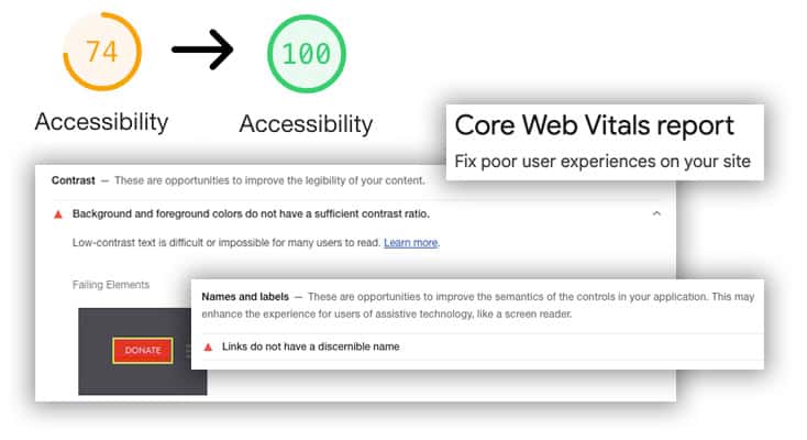
Making colours accessible is more than just following rules. It involves including everyone and ensuring that the web is usable for all.
Having a website with great accessibility is also great for your Google Web Vitals scores.
Web designers can create visually appealing and accessible experiences by considering aspects of colour usage.
FAQs
| Question | Answer |
|---|---|
| What are the best colour schemes for a professional website? | Professional websites often benefit from a palette of blues, greys, and whites, which convey trust, reliability, and clarity. |
| How do colours impact the user experience on a website? | Colorus can evoke emotions, influence perceptions, and guide user behaviour. For instance, red can create a sense of urgency, while blue can be calming. |
| Can changing a website’s colour scheme improve traffic? | A well-chosen colour scheme can enhance user engagement and time spent on the site which indirectly can increase future traffic. |
| What is the role of colour in website accessibility? | Colour plays a key role in accessibility, particularly in terms of contrast for readability and not using colour as the sole means of conveying information. |
| How often should I update my website’s colour scheme? | Only update your colour scheme when rebranding, to perhaps improve brand messaging, or to improve user experience and accessibility. |
| Are there any colours I should avoid in web design? | Colours can evoke emotions, influence perceptions, and guide user behaviour. For instance, red can create a sense of urgency, while blue can be calming. |
| How can I choose a colour scheme that reflects my brand? | Start with your brand’s identity and values. Use colours that resonate with your brand’s personality and the emotions you want to evoke in your audience. |
| What’s the significance of seasonal colour schemes in web design? | Seasonal colour schemes can keep your website looking fresh and relevant, align with marketing campaigns, and resonate with the changing moods of your audience. |
| Can colour schemes impact website conversion rates? | Yes, the right colour choices can influence user actions and decisions, potentially improving conversion rates. For example, a compelling call-to-action colour can attract more clicks. |
| What tools can help me choose a colour scheme for my website? | Tools like Adobe Color, Coolors, and Paletton can help in creating and testing colour schemes, offering both inspiration and practical solutions. |
Conclusion
Choosing h2o digital for web design services is a decision that aligns with success. We create custom websites that represent your brand and values. Our goal is to make sure your online presence stands out and reflects who you are.
Why Choose h2o Digital for Web Design?
- Expertise in Latest Trends: h2o digital stay ahead of the curve. Implementing the latest design trends and technologies to ensure your website is both modern and effective.
- Customised Solutions: Your brand is unique, and your website should be too. We offer customised solutions that resonate with your brand’s voice and appeal to your target audience.
- Focus on User Experience: We prioritise user experience, ensuring that your website is not only visually stunning but also user-friendly, accessible, and intuitive.
- SEO-Optimised Design: A beautiful website is only effective if it is seen. Our designs are SEO-optimised to enhance visibility and drive traffic.
- Responsive and Mobile-Friendly: h2o digital ensures your website is responsive and mobile-friendly. This provides a seamless experience across all devices.
What’s in It for You?
- Increased Engagement: A well-designed website attracts and retains visitors, increasing engagement and potentially boosting conversion rates.
- Stronger Brand Identity: A website that truly represents your brand can strengthen your identity and credibility in the market.
- Competitive Edge: A professional, cutting-edge website gives you an advantage over competitors, setting you apart.
Why You Need This Service
- Digital Presence: In the digital age, a website is often the first point of contact with potential customers. Make a lasting impression with a professionally designed site.
- Growth and Expansion: A well-designed website is a tool for growth, helping you reach a wider audience and explore new markets.
In conclusion, partnering with h2o digital for your web design needs is an investment in your brand’s future.
We dedicate ourselves to excellence and possess expertise in creating appealing and effective websites.