Key benefits of using a Responsive Web Design
Unfortunately, not all websites are created with mobile users in mind, and as a result that site is losing traffic.
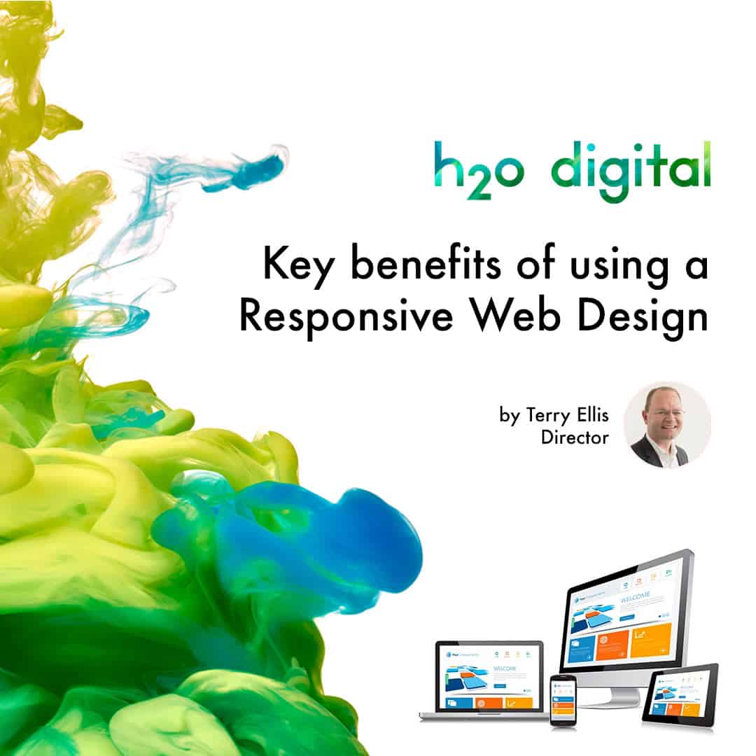
Desktop computers and laptops are being created every year with bigger and better screen sizes, resolutions and viewing abilities; and it seems that new phones and tablets are released monthly – but how do you know your website is displayed properly across all of those widescreens or high definition devices?
Consider using a responsive web design. Not only do these websites look elegant and professional, but your mobile viewers will appreciate fast loading times and low data consumption through their service plans. Not to mention, any banners or logos you may be using will be automatically adjusted to fit properly on the webpage the user is viewing instead of being squeezed or cut-off on the edges.
Interactive and engaging
Responsive websites are no less engaging than non-responsive, in fact, you can still have the same amount of images and video integrated on your site as before. This time, however, it’s normally only loaded on-demand to save on page loading times and to prevent overage charges on viewer’s data plans when viewed on a mobile device.
In creating an interactive site, your viewers can swipe and pull certain parts of the website to view additional pages, navigational tabs or information panels when they need them instead of trying to have it all crammed onto the same small screen.
Your text size can be larger and clear, and will be adjusted to fit on any size screen properly. Engaging your viewers will keep them on your page longer, viewing your products or services; it will also be an enjoyable experience for your audience as well.
People want easy access to information at any time and from anywhere; being able to offer that to them will start building good audience relations.
Benefits of using responsive sites
Web designers can save quite a bit of time when using responsive web design. In the past, you would normally have to build two complete websites entirely; one for desktop users and one for those on mobile devices.
With a responsive site, one site can automatically adjust to the viewing environment; be it a desktop computer, small laptop, wide-screen device, smartphone or tablet device.
Adding responsive web design to your mobile marketing campaign can help improve conversion rates as well. Viewers and potential customers love viewing websites without having to zoom around the page in order to read it.
If your navigation is awkward or your images are incomplete or being displayed improperly the person will leave your site and find a better site to view, such as your competition. With a single responsive site, your campaign success can be tracked and monitored for analysing much easier than if you had separate sites for desktop and mobile devices respectively.
Keep it all together in one and you can keep tighter tabs on your analytics.
Find out more about Responsive Web Design from H22 Solutions


